Rationale
Basic CUSUM statistics are fairly straightforward to construct in a spreadsheet, if you only need to compare to a target value, or the mean of your data. However, turning this into a control chart takes a lot more work, especially if you have several metrics to analyse.
The goal of this package is to allow you to pass simple vectors in, and receive data back that contains all the information you need to create faceted CUSUM control charts - (there is also a function that takes care of this for you).
A journey through the package functions
test_vec <- c(1,1,2,3,5,7,11,7,5,7,8,9,5)
test_vec
#>  [1]  1  1  2  3  5  7 11  7  5  7  8  9  5
Here is our data, nothing too exciting is it?
Or is it?
Let’s find out..
cusum_single
test_vec <- c(1,1,2,3,5,7,11,7,5,7,8,9,5)
variances <- cusum_single(test_vec)
p <- qplot(y = variances)
p <- p + geom_line()
p + geom_hline(yintercept = 0)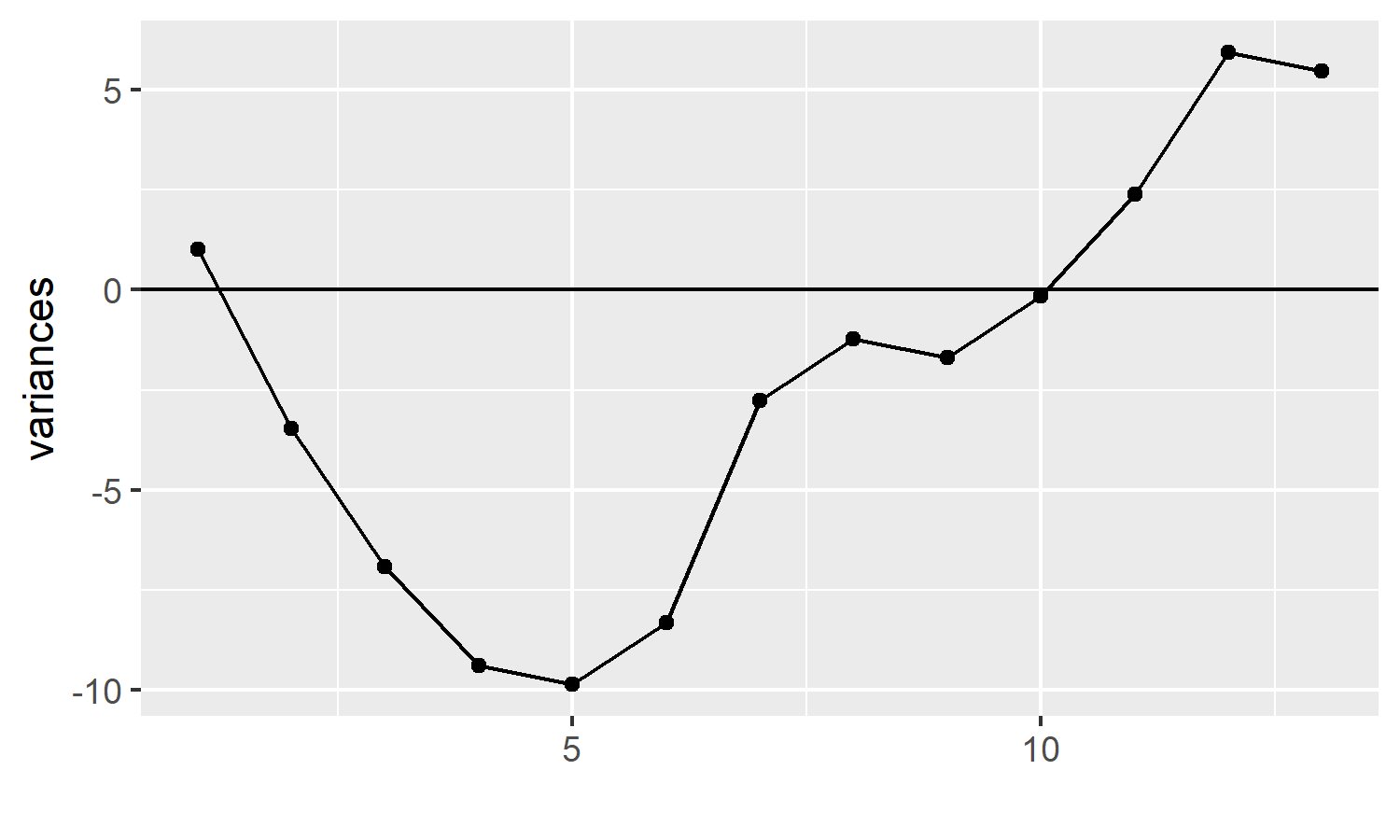
p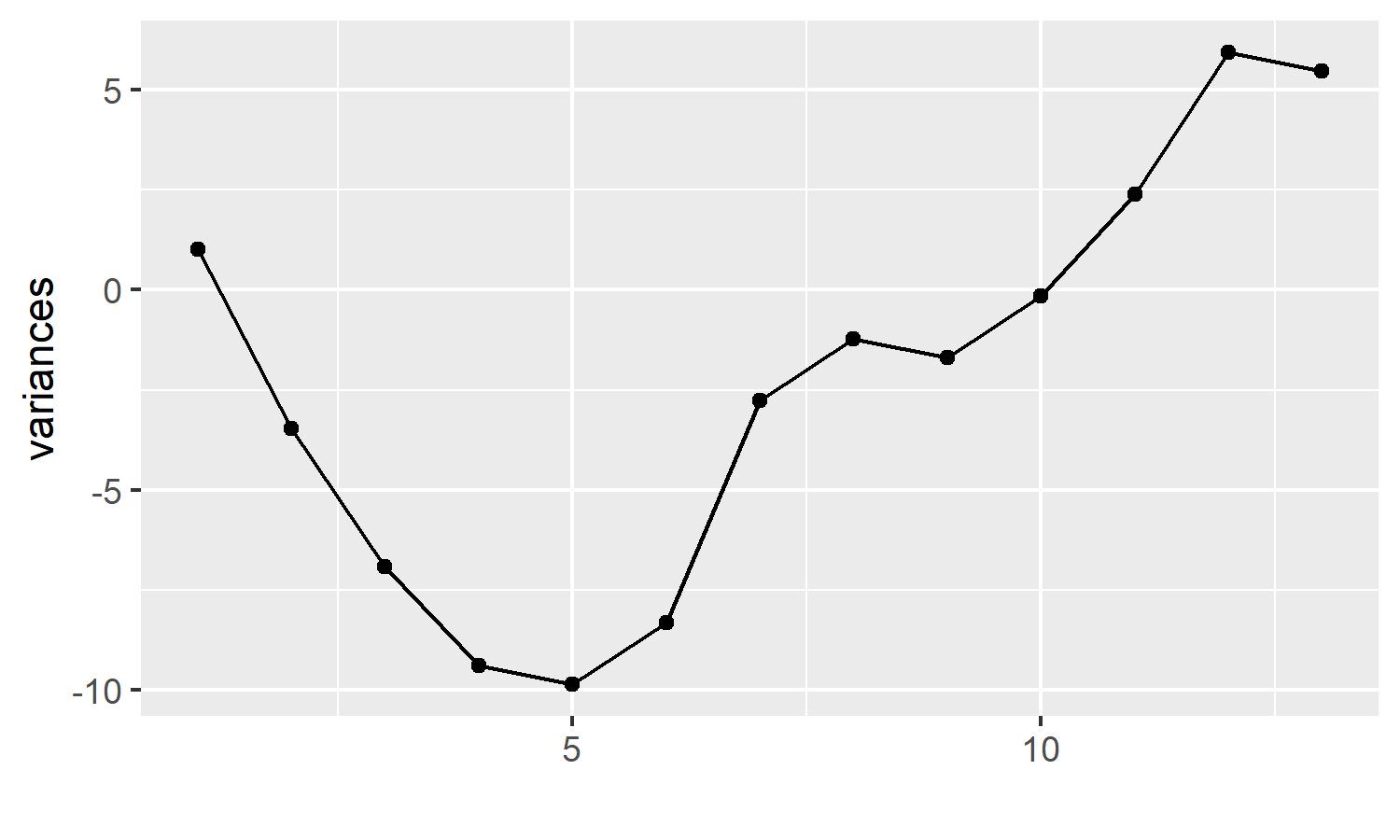
This bare bones plot tells us quite a lot. Our measure of interest started off with small variances, resulting in points below the centre line at 0, but the variances increased, the points crossed over the centre line.
cusum_single_df
We input the same vector - this time using the cusum_single_df function. This returns :
- our original vector
- the target value (if not supplied, the mean is calculated)
- the variance of each data point from the target
- the cumulative sum of these variances
- the cumulative sum of these variances, centred on the target value ( by adding the target to the cumulative sum, i.e. adding
cusum_targettocusumx)
variance_df <- cusum_single_df(test_vec)
variance_df
#>     x   target         si        cusumx cusum_target
#> 1   1 5.461538 -4.4615385 -4.461538e+00    1.0000000
#> 2   1 5.461538 -4.4615385 -8.923077e+00   -3.4615385
#> 3   2 5.461538 -3.4615385 -1.238462e+01   -6.9230769
#> 4   3 5.461538 -2.4615385 -1.484615e+01   -9.3846154
#> 5   5 5.461538 -0.4615385 -1.530769e+01   -9.8461538
#> 6   7 5.461538  1.5384615 -1.376923e+01   -8.3076923
#> 7  11 5.461538  5.5384615 -8.230769e+00   -2.7692308
#> 8   7 5.461538  1.5384615 -6.692308e+00   -1.2307692
#> 9   5 5.461538 -0.4615385 -7.153846e+00   -1.6923077
#> 10  7 5.461538  1.5384615 -5.615385e+00   -0.1538462
#> 11  8 5.461538  2.5384615 -3.076923e+00    2.3846154
#> 12  9 5.461538  3.5384615  4.615385e-01    5.9230769
#> 13  5 5.461538 -0.4615385 -1.776357e-15    5.4615385
p <- qplot(y = variance_df$x)
p <- p + geom_line()
p <- p + geom_hline(yintercept = variance_df$target)
p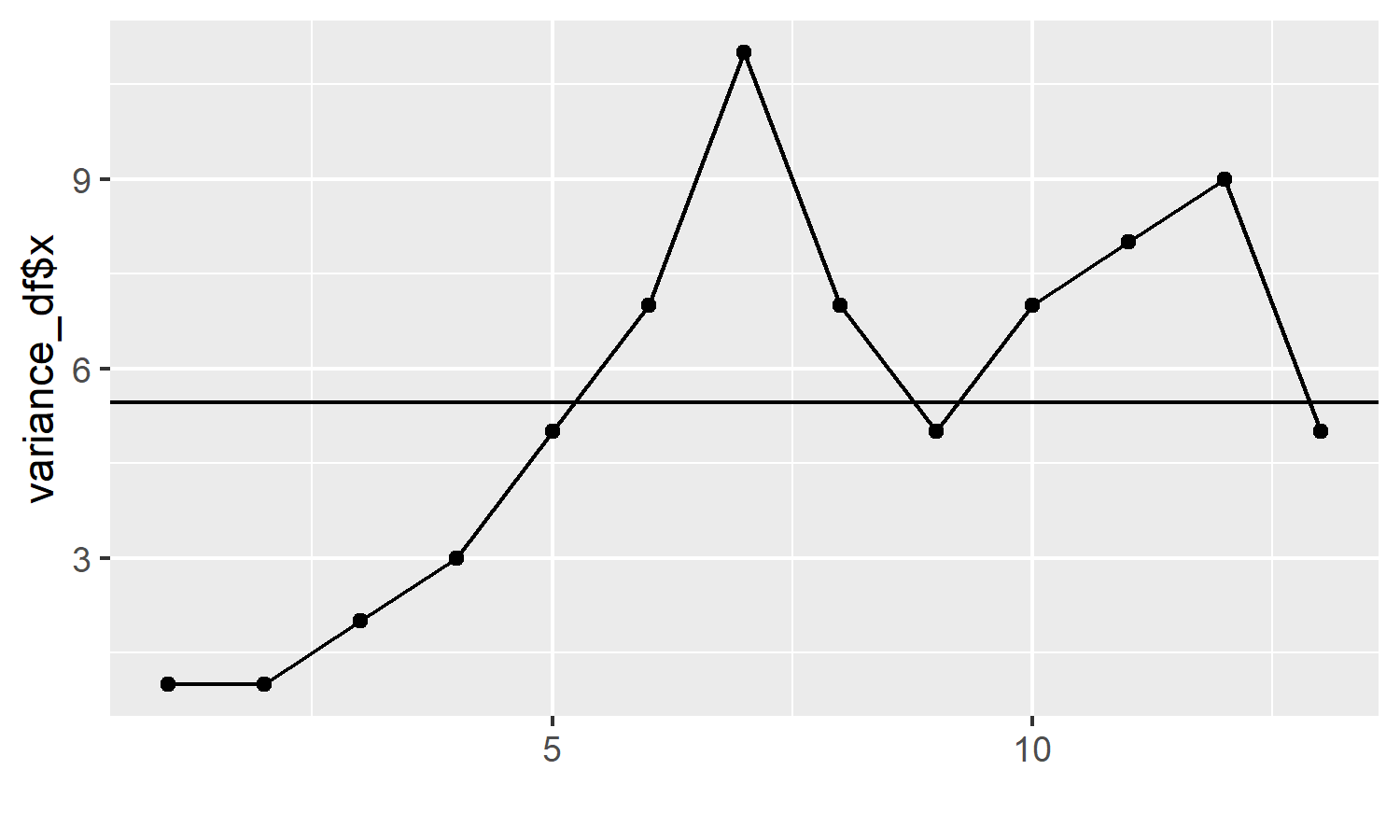
cusum_control
Here we input the same vector, and receive even more information back :
- our original vector (x)
- target (supplied or calculated)
- variance of x from target
- std_dev - you can supply a standard deviation (if known), or it is calculated for you using the screened moving range of x
- cusum is the cumulative sum of the variance
- cplus and cneg depend on the target and k values, and also relate to the current x value and previous cplus or cneg value. These are the values that get plotted on the control chart, hence why you only have to supply an argument for the x axis.
- cum_nplus and cum_nneg are also iterative values that calculate the number of consecutively rising or declining points.
- ucl and lcl are derived from the provided h value (usually between 4 and 5, defaults to 4). This is multiplied by the std_dev to calculate the upper and lower control limits (ucl and lcl respectively).
- the centre value is always 0
- obs provides a reference for each value of x, for ease of plotting.
cs_data <- cusum_control(test_vec)
#> no target value supplied, so using the mean of x
cs_data
#>     x   target   variance std_dev         cusum     cplus       cneg cum_nplus
#> 1   1 5.461538 -4.4615385 1.77305 -4.461538e+00 0.0000000  -3.575014         0
#> 2   1 5.461538 -4.4615385 1.77305 -8.923077e+00 0.0000000  -7.150027         0
#> 3   2 5.461538 -3.4615385 1.77305 -1.238462e+01 0.0000000  -9.725041         0
#> 4   3 5.461538 -2.4615385 1.77305 -1.484615e+01 0.0000000 -11.300055         0
#> 5   5 5.461538 -0.4615385 1.77305 -1.530769e+01 0.0000000 -10.875068         0
#> 6   7 5.461538  1.5384615 1.77305 -1.376923e+01 0.6519367  -8.450082         1
#> 7  11 5.461538  5.5384615 1.77305 -8.230769e+00 5.3038734  -2.025095         2
#> 8   7 5.461538  1.5384615 1.77305 -6.692308e+00 5.9558101   0.000000         3
#> 9   5 5.461538 -0.4615385 1.77305 -7.153846e+00 4.6077469   0.000000         4
#> 10  7 5.461538  1.5384615 1.77305 -5.615385e+00 5.2596836   0.000000         5
#> 11  8 5.461538  2.5384615 1.77305 -3.076923e+00 6.9116203   0.000000         6
#> 12  9 5.461538  3.5384615 1.77305  4.615385e-01 9.5635570   0.000000         7
#> 13  5 5.461538 -0.4615385 1.77305 -1.776357e-15 8.2154937   0.000000         8
#>    cum_nneg      ucl       lcl centre obs
#> 1         1 7.092199 -7.092199      0   1
#> 2         2 7.092199 -7.092199      0   2
#> 3         3 7.092199 -7.092199      0   3
#> 4         4 7.092199 -7.092199      0   4
#> 5         5 7.092199 -7.092199      0   5
#> 6         6 7.092199 -7.092199      0   6
#> 7         7 7.092199 -7.092199      0   7
#> 8         0 7.092199 -7.092199      0   8
#> 9         0 7.092199 -7.092199      0   9
#> 10        0 7.092199 -7.092199      0  10
#> 11        0 7.092199 -7.092199      0  11
#> 12        0 7.092199 -7.092199      0  12
#> 13        0 7.092199 -7.092199      0  13
cusum_control_plot
The cusum_control function is the most complex and important function in the package
The outputs are not much to look at however, so we harness the power of ggplot2 to enjoy the benefits
If we assume that we don’t want to be outside our upper control limit, we can see that we now have a problem:
cusum_control_plot(cs_data,xvar = obs)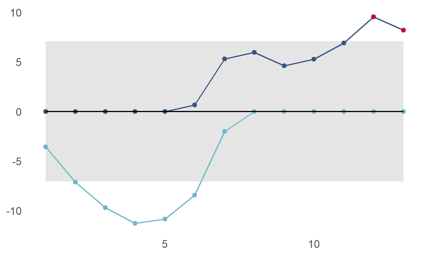
We can also highlight points below the lower control limit using show_below
cusum_control_plot(cs_data,xvar = obs, show_below = TRUE)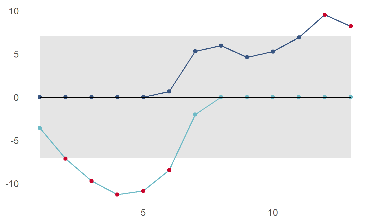
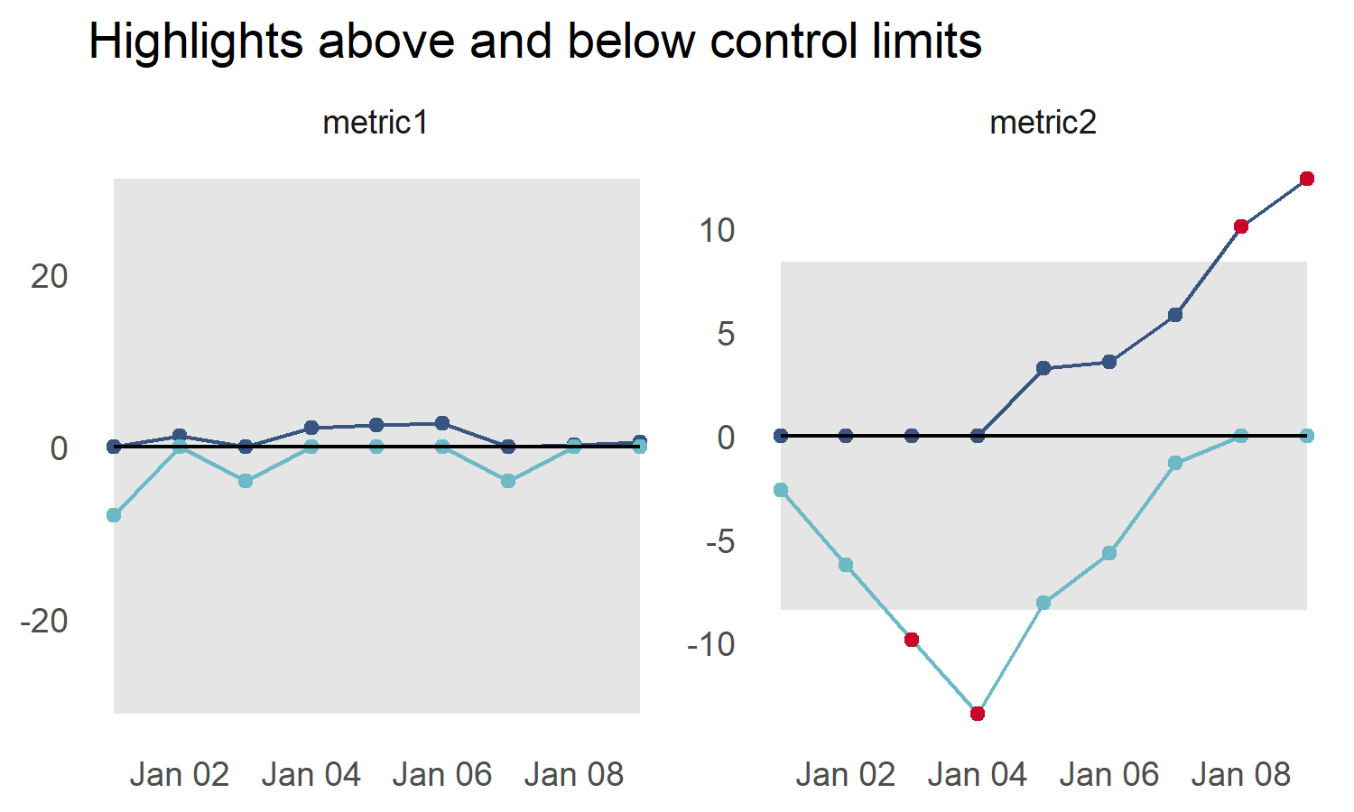
Faceted displays and flexible x axis
We can plot many charts at once by using dplyr or `data.table to group the data
library(dplyr)
#>
#> Attaching package: 'dplyr'
#> The following objects are masked from 'package:stats':
#>
#>     filter, lag
#> The following objects are masked from 'package:base':
#>
#>     intersect, setdiff, setequal, union
library(ggplot2)
library(cusumcharter)

testdata <- tibble::tibble(
N = c(-15L,2L,-11L,3L,1L,1L,-11L,1L,1L,
2L,1L,1L,1L,10L,7L,9L,11L,9L),
metric = c("metric1","metric1","metric1","metric1","metric1",
"metric1","metric1","metric1","metric1","metric2",
"metric2","metric2","metric2","metric2","metric2",
"metric2","metric2","metric2"))

datecol <- as.Date(c("2021-01-01","2021-01-02", "2021-01-03", "2021-01-04" ,
             "2021-01-05", "2021-01-06","2021-01-07", "2021-01-08",
             "2021-01-09"))

testres <- testdata %>%
  dplyr::group_by(metric) %>%
  dplyr::mutate(cusum_control(N)) %>%
  dplyr::ungroup() %>%
  dplyr::group_by(metric) %>%
  dplyr::mutate(report_date = datecol) %>%
  ungroup()
#> no target value supplied, so using the mean of x
#> no target value supplied, so using the mean of x


p5 <- cusum_control_plot(testres,
                         xvar = report_date,
                         show_below = TRUE,
                         facet_var = metric,
                         title_text = "Highlights above and below control limits")
p5